Van Cleef & Arpels Mid-Century Advertising Campaign

From the very beginning, Van Cleef & Arpels developed their own style, not following fashion trends. The exclusivity and classic beauty of Van Cleef & Arpels’ jewelry earned them the Grand Prix at the 1925 International Exhibition of Decorative Arts. Their success then became permanent, with a Grand Prix at the Colonial Exhibition in Paris and a special prize at the 1931 World’s Fair in New York.
Undoubtedly, the brand’s global success was also fueled by an extensive advertising campaign in the most popular fashion magazines, which began in the late 1930s. This was the period when part of the workshops moved to New York, where Pierre Arpels opened the first boutique on Fifth Avenue. In 1939, the second generation of the family, Claude and Jacques, headed the jewelry house.

In America, far from the battlefields of Europe, demand for luxury not only remained strong but steadily grew. A representative office in Palm Beach was added to the New York office. Van Cleef & Arpels developed their own style, not following fashion trends.

Black-and-white jewelry advertisements

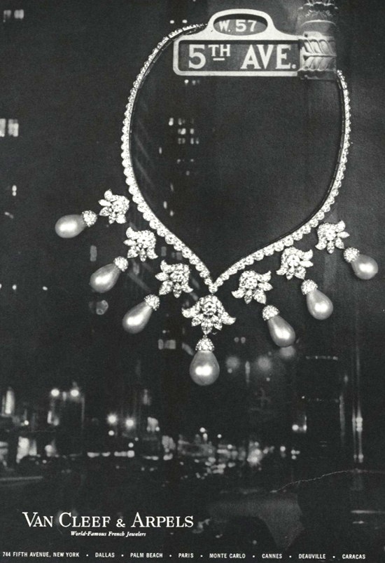
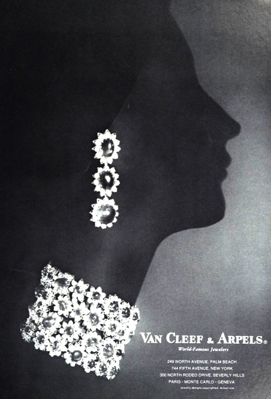
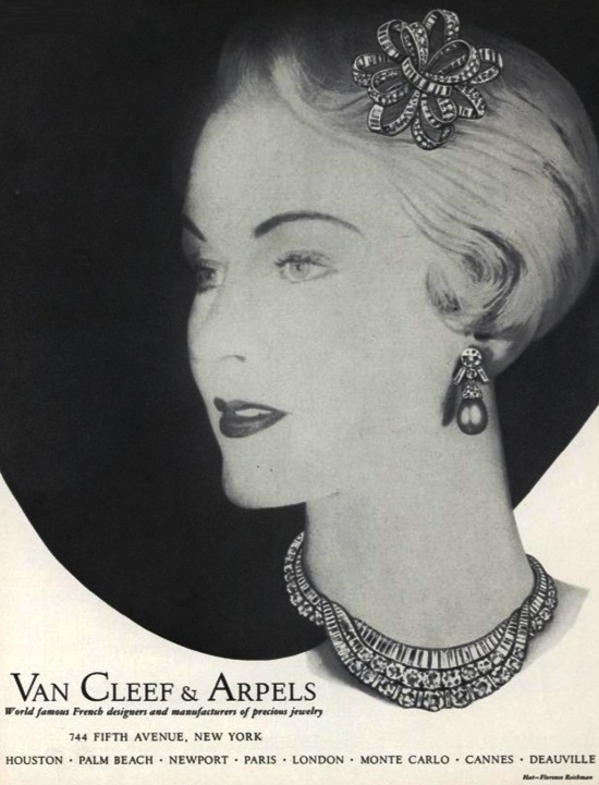
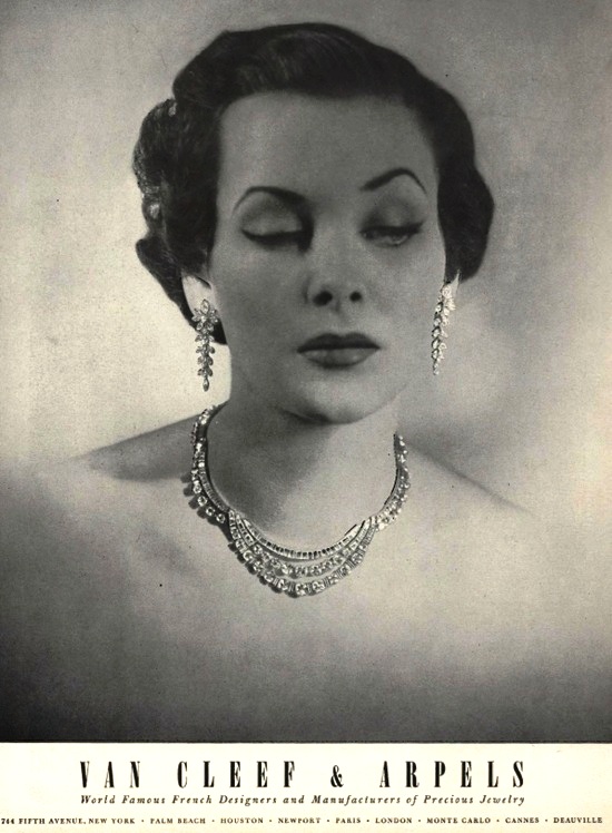
Vintage black-and-white jewelry advertisements from the French brand possess a unique emotional appeal. They combine the romance of a bygone era with nostalgia for the “golden age” of jewelry. Many advertising posters from the late 1930s and 1940s feature midnight backgrounds, with landscapes or female silhouettes adorned with sparkling diamonds.

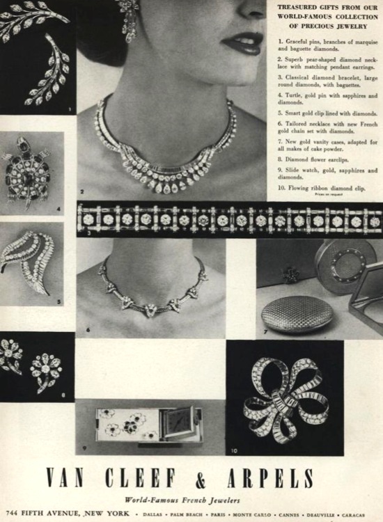
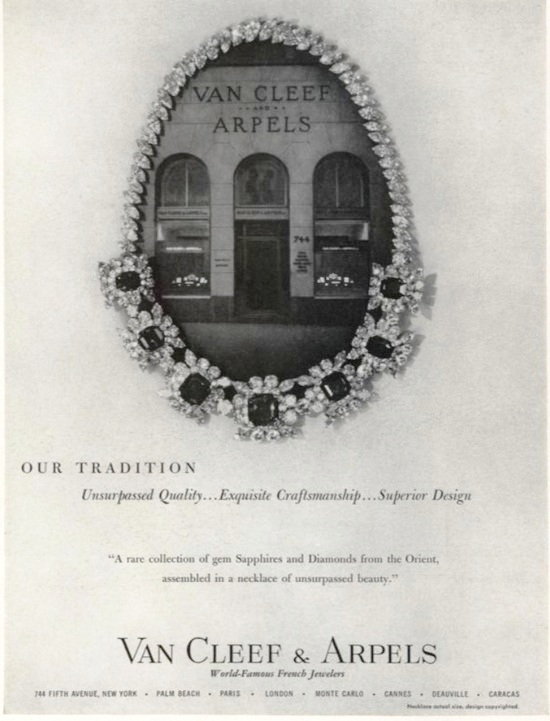
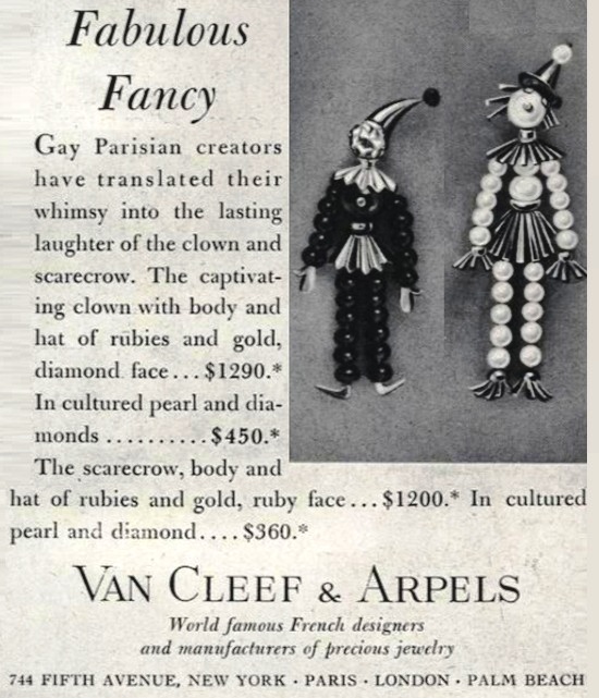
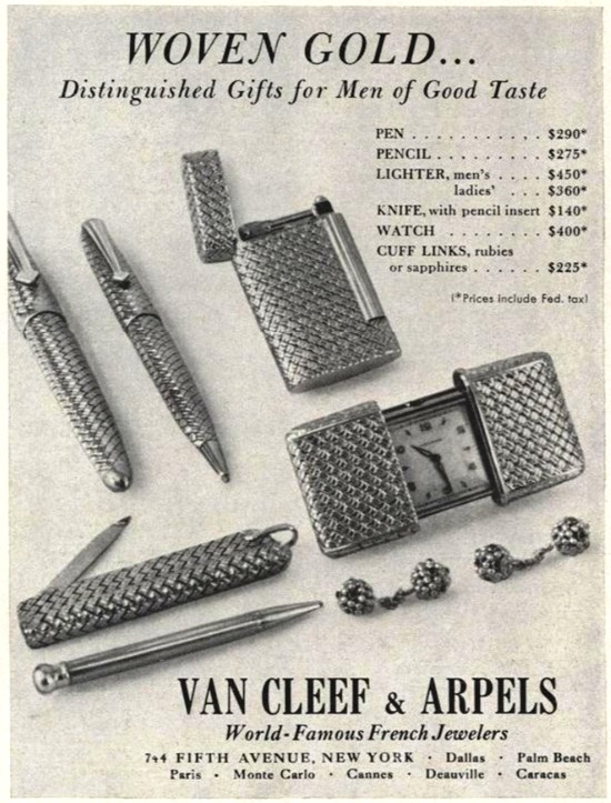
Advertising posters from the 1950s and 1960s showcase jewelry against a simple, light background, without any elements of mystery or glamour. This allows for a more detailed examination of the jewelry, which is also a good thing.
Another series of advertising posters features beautiful female models adorned with necklaces, earrings, and bracelets in Art Deco, Art Nouveau, and Victorian styles.

Ads in Color
Black and white ads are undoubtedly more restrained and minimalist, and they attract attention to the jewelry rather than on extraneous details. Colored advertising, while more memorable, is less dramatic and more clear and specific, which limits the viewer’s imagination. Furthermore, the choice of color can either attract or repel potential buyers.



Van Cleef & Arpels black and white ads